Color is a powerful tool in art, capable of evoking emotions, setting moods, and influencing perception. Artists throughout history have harnessed the psychology of colors to create impactful works that communicate beyond words. Understanding how colors affect human psychology can help artists, designers, and even marketers convey specific messages effectively.
The Emotional Impact of Colors
Each color has its own psychological and emotional impact, often influenced by cultural associations and personal experiences. Here’s a look at the emotional responses typically linked to different colors:
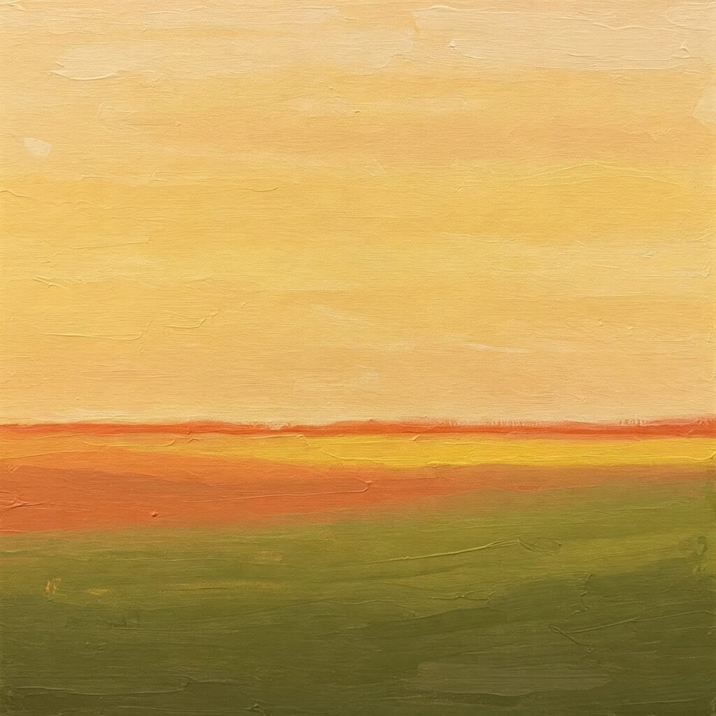
Warm Colors: Energy and Passion
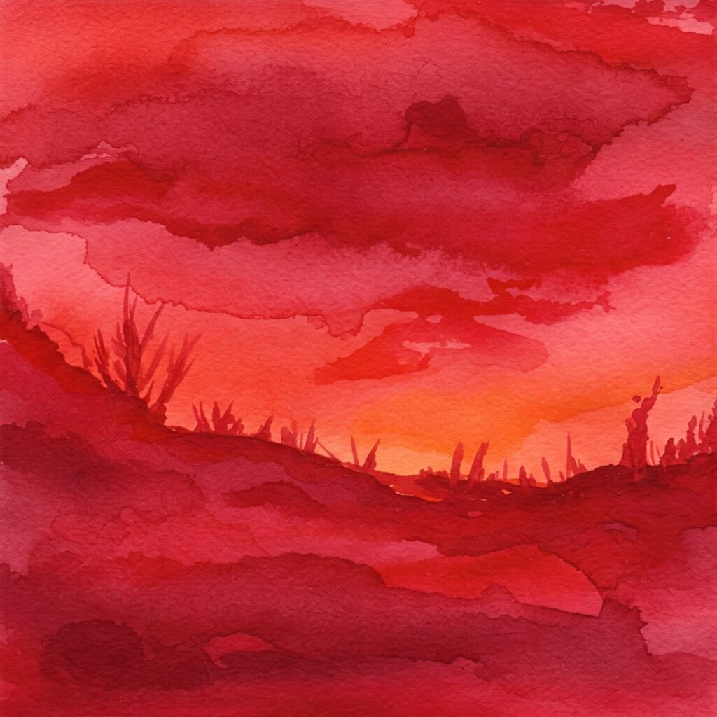
- Red – Often associated with passion, love, and danger, red is a strong, stimulating color that can evoke excitement and urgency. It can draw attention and create a sense of power.
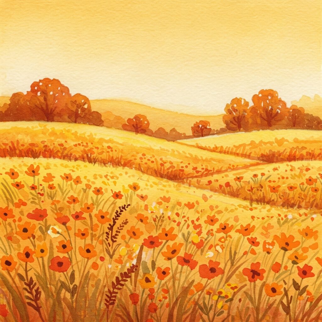
- Orange – A color of enthusiasm, creativity, and warmth, orange combines the energy of red and the cheerfulness of yellow, making it an uplifting and friendly color.
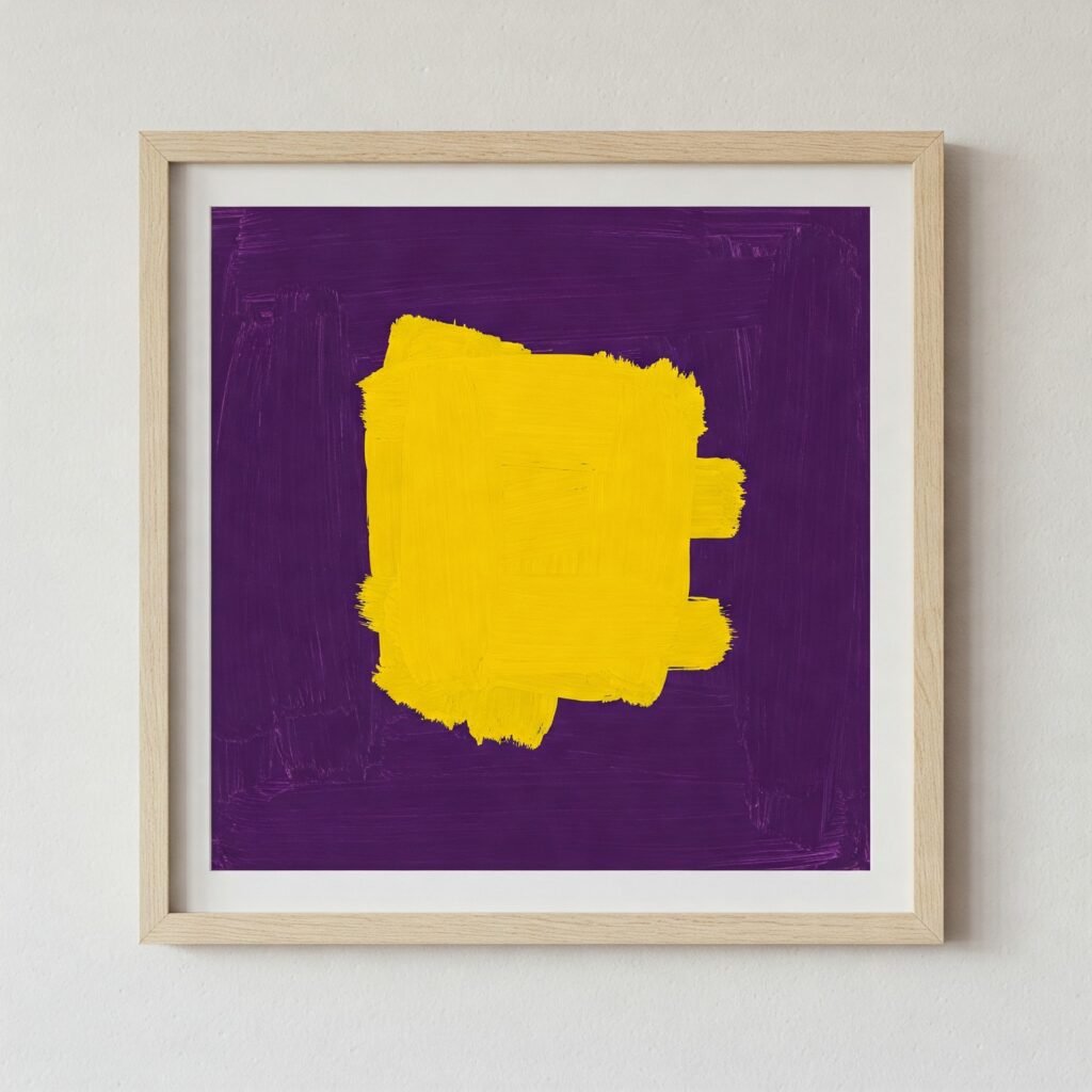
- Yellow – Bright and cheerful, yellow symbolizes happiness, optimism, and warmth. However, excessive use can lead to feelings of frustration or anxiety.
Cool Colors: Calm and Serenity

- Blue – A color of tranquility, trust, and intelligence, blue is often used to create a calming effect. Lighter blues evoke a sense of openness and peace, while darker blues suggest stability and professionalism.
- Green – Representing nature, growth, and harmony, green is a soothing color that balances emotions and symbolizes renewal.
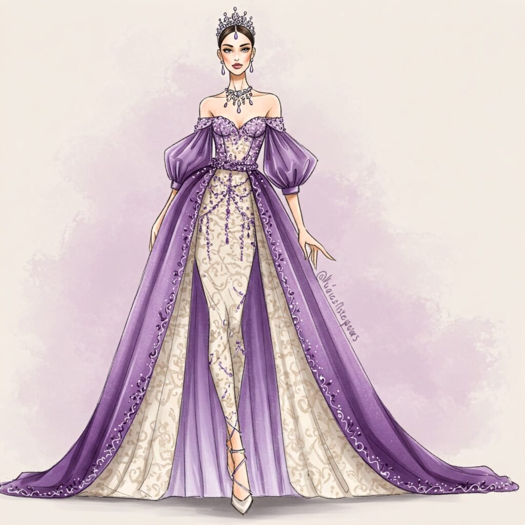
- Purple – Often associated with royalty, mystery, and spirituality, purple blends the stability of blue with the energy of red, making it both calming and stimulating depending on the shade.
Neutral Colors: Versatility and Subtlety
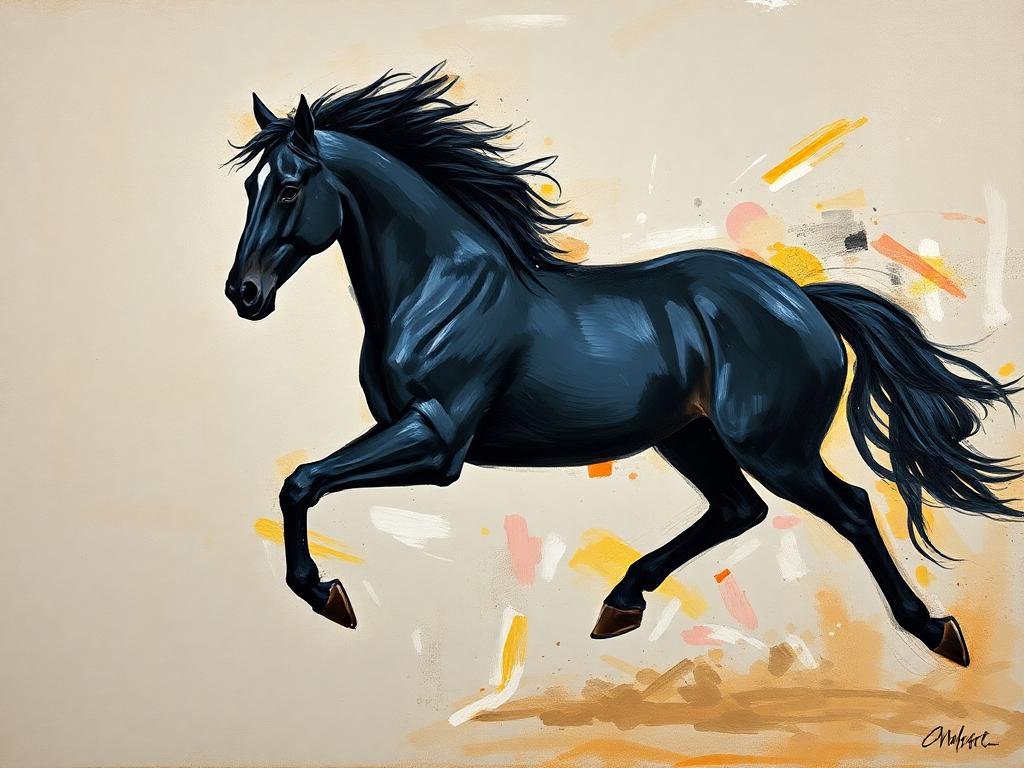

- Black – A color of sophistication, mystery, and power, black can create a dramatic or formal atmosphere in art.
- White – Symbolizing purity, simplicity, and peace, white is often used to create a sense of space and clarity.
- Gray – Representing balance and neutrality, gray is often seen as a color of sophistication but can also evoke a sense of detachment.
- Brown – An earthy and warm color, brown signifies stability, reliability, and comfort.
Color Harmonies and Their Psychological Effects
Artists use different color schemes to create specific psychological effects in their work. Some common color harmonies include:
- Monochromatic – Uses variations of a single color. This scheme creates unity and a harmonious effect, often used in minimalist or focused compositions.
- Analogous – Uses colors that are next to each other on the color wheel (e.g., blue, green, and teal). It creates a sense of cohesion and serenity.
- Complementary – Uses colors opposite each other on the color wheel (e.g., blue and orange, red and green). This scheme creates a high contrast and dynamic energy.
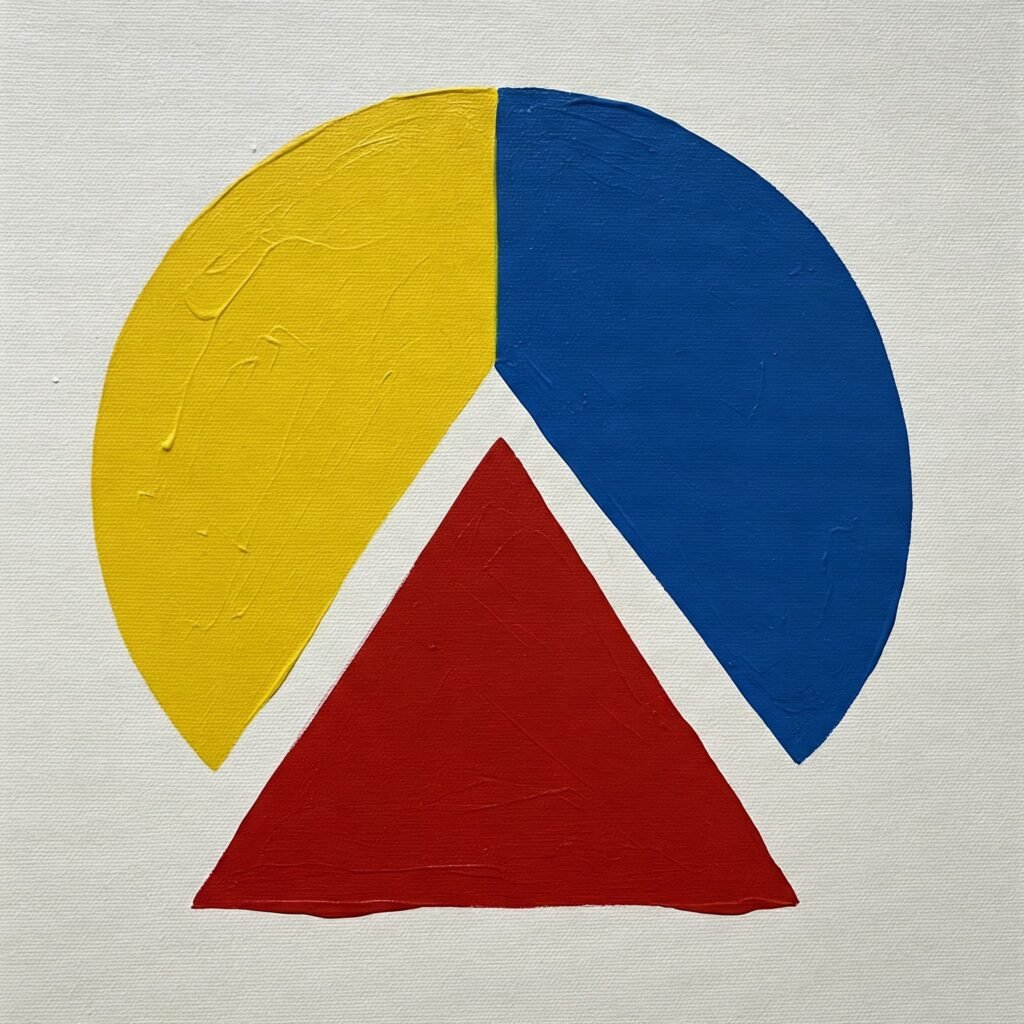
- Triadic – Uses three equally spaced colors on the color wheel (e.g., red, yellow, and blue). It offers a vibrant and balanced effect.
The Cultural Influence on Color Perception
Color symbolism can vary across different cultures. For example:
- In Western cultures, white is associated with purity and weddings, while in some Eastern cultures, it symbolizes mourning and death.
- Red signifies luck and prosperity in Chinese culture but can indicate danger in Western contexts.
- Black is associated with mourning in many cultures but is also a symbol of power and elegance in fashion.
The Use of Colors in Art Movements
Different art movements have utilized colors in unique ways:
- Impressionism – Artists like Claude Monet used bright, contrasting colors to capture light and atmosphere.
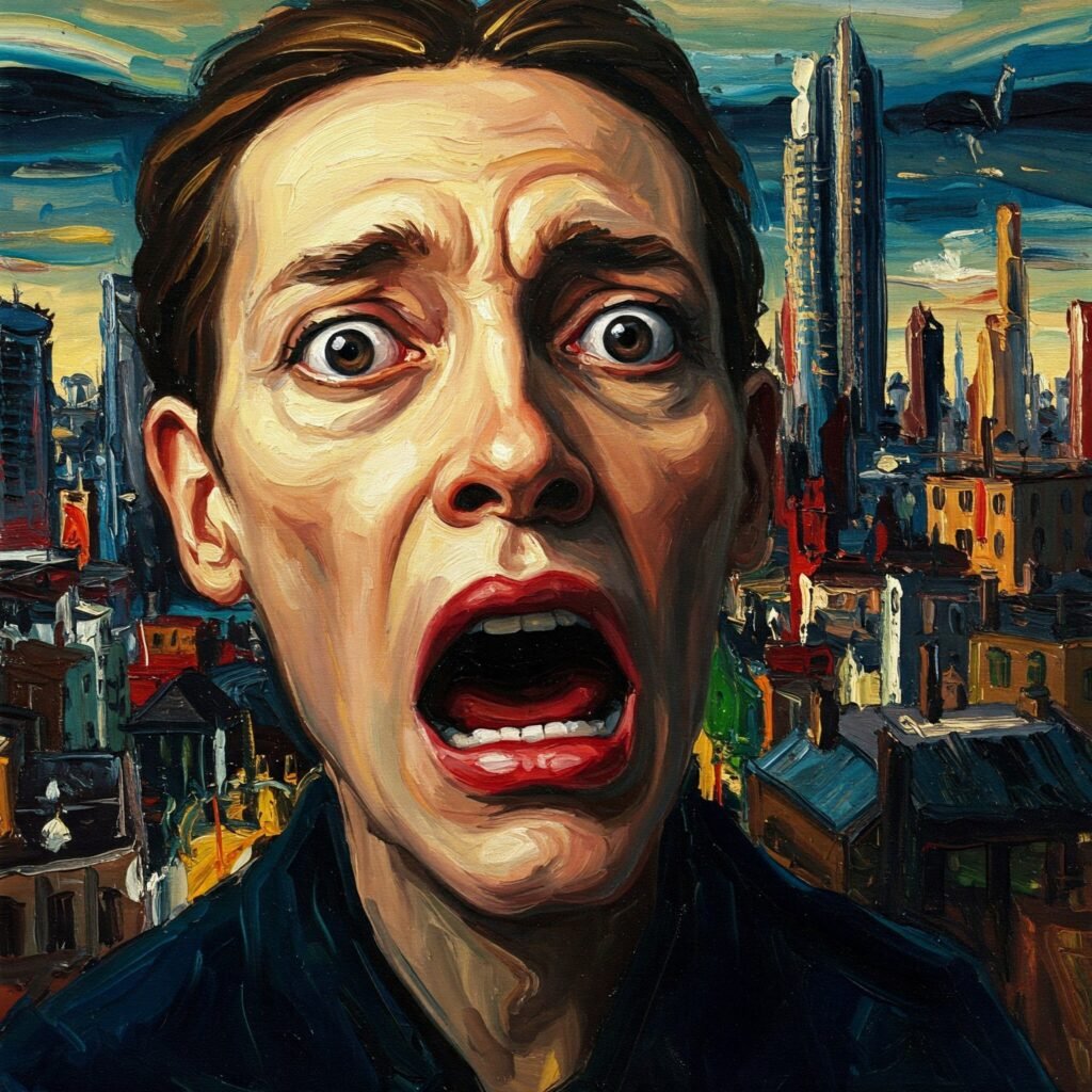
- Expressionism – Artists like Edvard Munch used bold, exaggerated colors to evoke intense emotions.
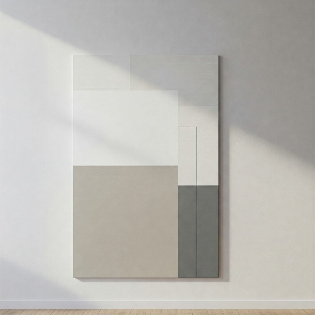
- Minimalism – Relies on neutral colors and simple compositions to create balance and harmony.
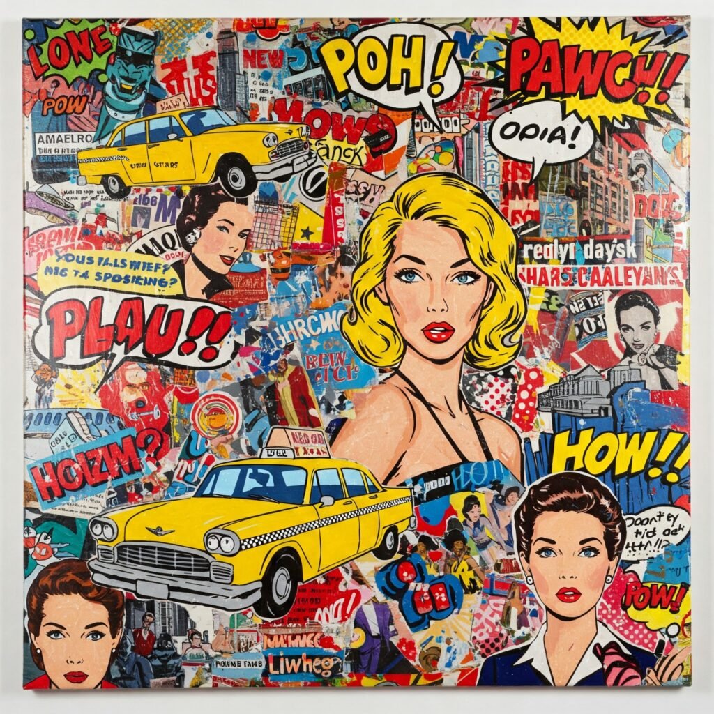
- Pop Art – Uses vibrant, commercial-inspired colors to grab attention and challenge artistic norms.

Conclusion
The psychology of colors in art is a fascinating and essential aspect of artistic expression. Whether used to evoke emotions, create balance, or communicate cultural significance, colors have a profound impact on how art is perceived. By understanding color theory and its psychological effects, artists can harness this powerful tool to enhance their creative work and connect with their audience on a deeper level.